NSERC Discovery Grants 2013 in Computer Science

The results of the NSERC Discovery Grants for 2013 have been published.
The full list of results can be found here. As it is becoming a tradition (results of 2011, 2012), here is my analysis of this year’s results.
What is the distribution of grants?
The total amount for Discovery Grants in Computer Science was $4,894,000 ( $5,943,920 last year) divided into 204 grants (227 last year). There were 3 1-year and 187 5-year (11 1-year, 3 3-year, 213 5-year in 2012). They went to 42 different institutions (49 last year).
Minimum amount was $15k ($14k last year), first quartile $20k ($17k), median $20 ($22k), mean $25.758k ($25.38k), 3rd $30k ($28k), max $75k ($122.2k).
Compared to 2012, there is a slight reduction in the size awards.
This is the distribution of grants per amount.
| Amount | No. Grants |
|---|---|
| 15,000 | 44 |
| 20,000 | 53 |
| 25,000 | 29 |
| 30,000 | 23 |
| 36,000 | 22 |
| 44,000 | 11 |
| 52,000 | 3 |
| 62,000 | 3 |
| 66,000 | 1 |
| 75,000 | 1 |
A simple way to visualize this data is tot plot individuals to amounts. Colours reflect the province (click to enlarge):
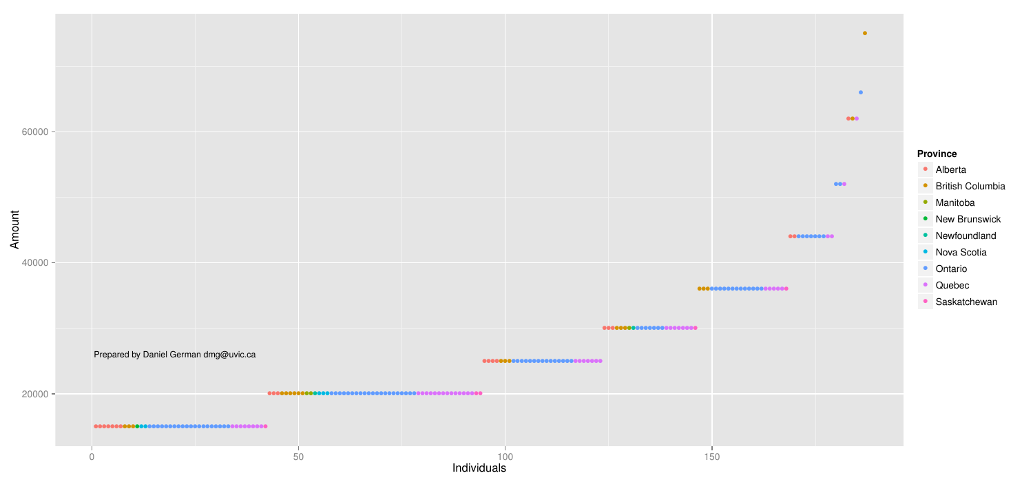
As it can be seen, there is a fairly uniform distribution across the lowest amounts, with few outliers to the right. Not surprisingly Ontario is, again, the most frequent. Ontario and BC represent most of the points at the right side.
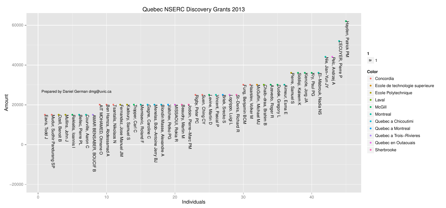
By Province
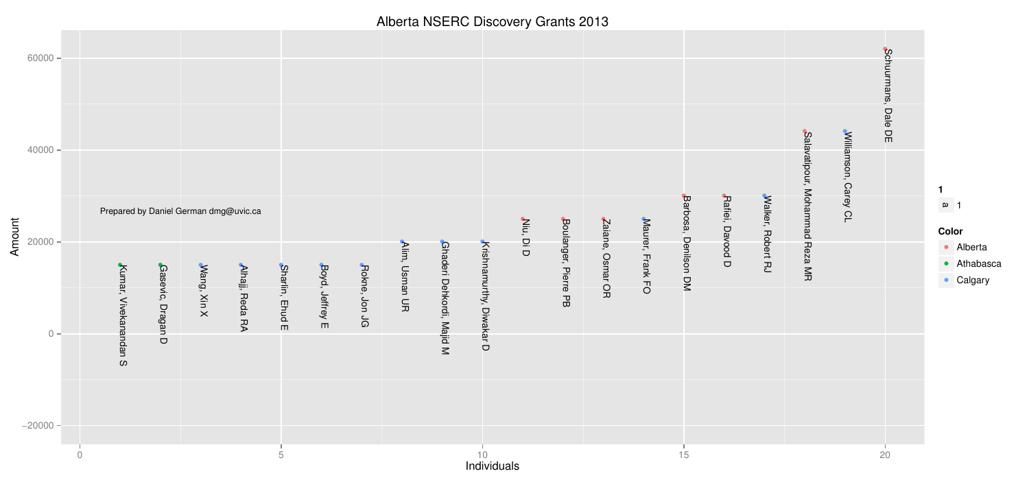
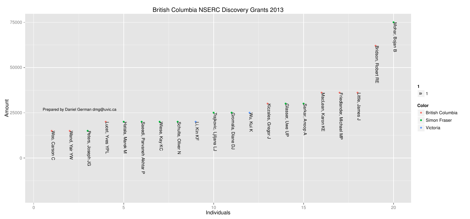
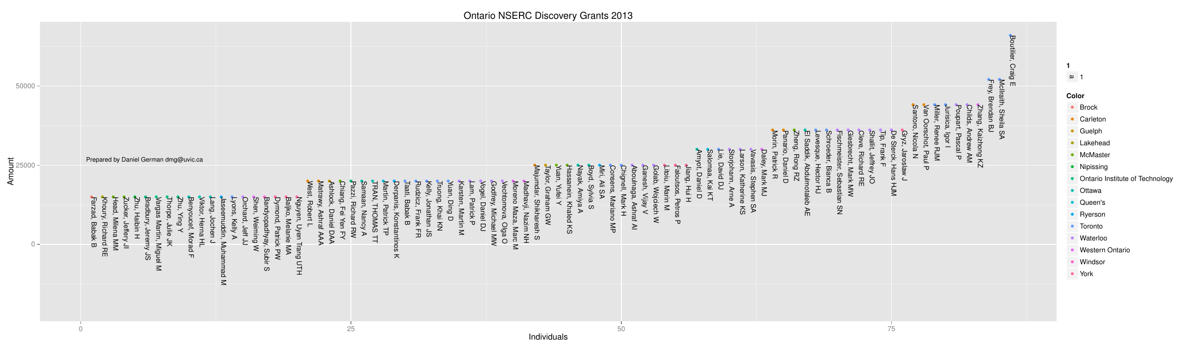
Here is a breakdown of the 4 big ones:
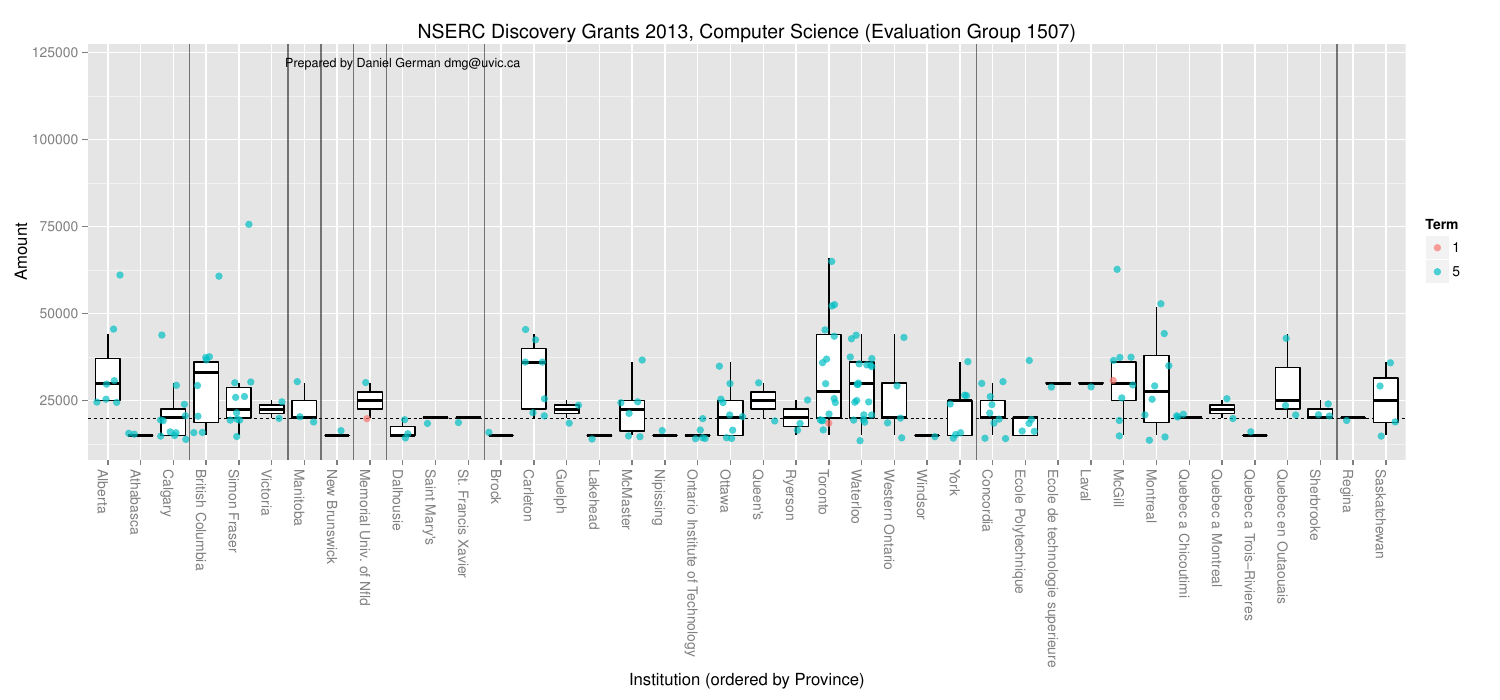
How do institutions compare?
I present the results arranged by University. Each vertical column is a university; they have been sorted by province. Each point in the plot is a recipient. The colour of the point represents the type of grant (1 to 5 years). Most are 5 years, with few being 1 year (what I call probation grant: they either have faith you can do significantly better next year, or they are giving you a warning signal).
The median across the country was $20k per year (in the spirit of disclosure mine is $24k–2011).
The boxplots are a simpler way to compare universities and are overlayed on the data. I have removed outliers from them to avoid confusion with the data points. Of course, if you have paid attention to your stats courses you will know that boxplots are good when the data is normally distributed (which I don’t assume it is). Hence their use in this data is flawed, but they are still useful.
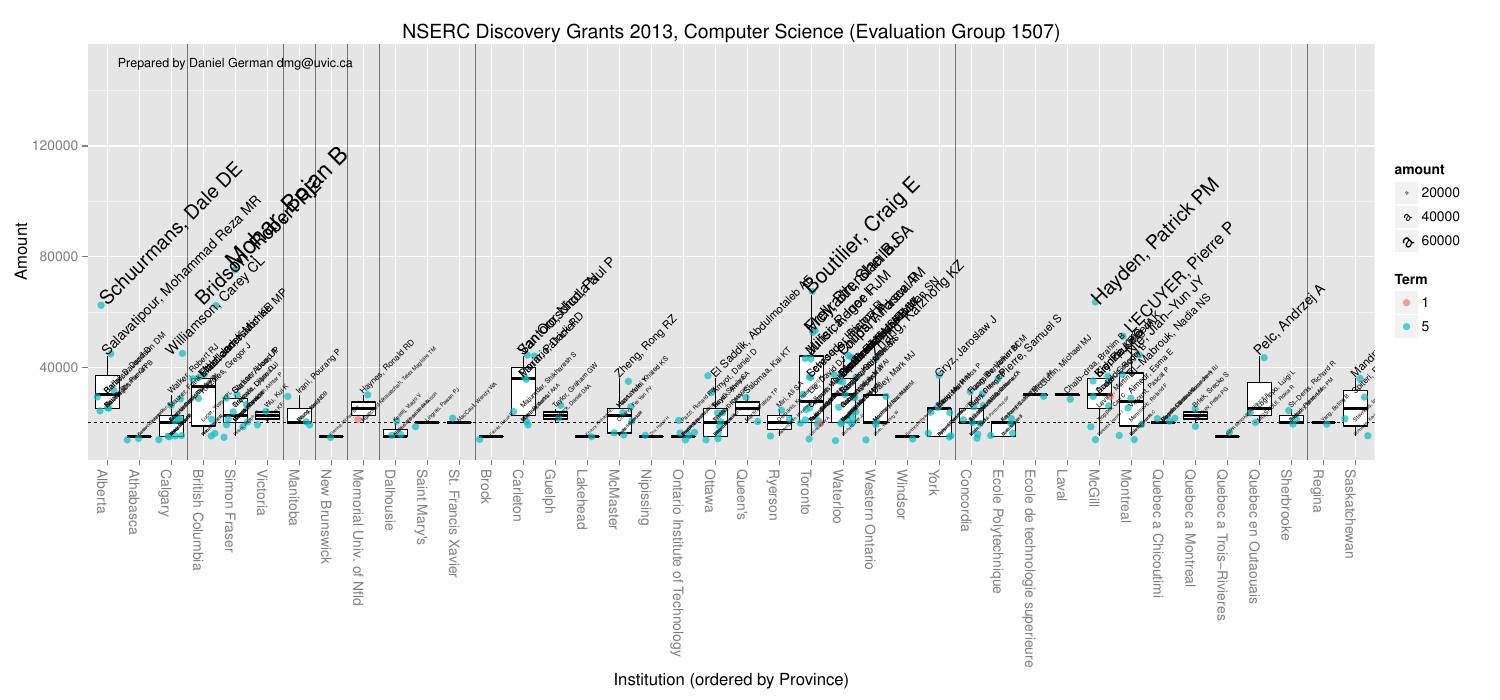
I also got curious who the high fliers were. And below the points are labelled.
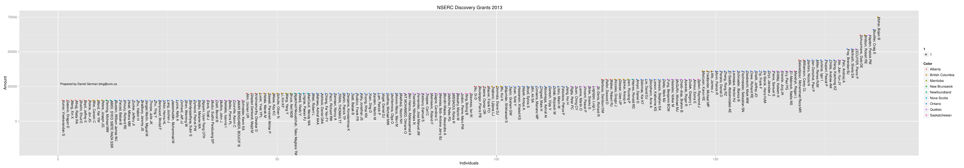
Everybody
And here is the list of every single person:
Epilogue
At this point, everybody is in the new cycle. This will make comparing across years easier. That will be the next installment…
–dmg