NSERC Discovery Grants 2011 in Computer Science

NSERC has published the results of the NSERC discovery grant competition in 2011. NSERC only published the raw data, so with a little bit of initiative one can retrieve it and visualize it.
I had several questions about this data….
What is the distribution of grants?
First, the total amount for Discovery Grants in Computer Science was $5,126,543 per year divided in 202 grants (10 1 year, 1 2 year, 1 3 year and the rest 5 years). They went to 45 different institutions.
Minimum amount was $14k, first quantile $20k, median $24k, average, $25.380k, third quartile $29k, and maximum of $96k (find out below who got it). A Shapiro-Wilk test shows that this distribution appears NOT to be normal (p << 0.01).
This is the distribution of grants per amount.
| Amount | No. Grants |
|---|---|
| 14,000 | 46 |
| 15,000 | 1 |
| 18,000 | 1 |
| 20,000 | 39 |
| 24,000 | 43 |
| 29,000 | 34 |
| 33,000 | 19 |
| 42,000 | 7 |
| 49,000 | 6 |
| 59,243 | 1 |
| 60,000 | 1 |
| 60,300 | 1 |
| 76,000 | 1 |
| 85,000 | 1 |
| 96,000 | 1 |
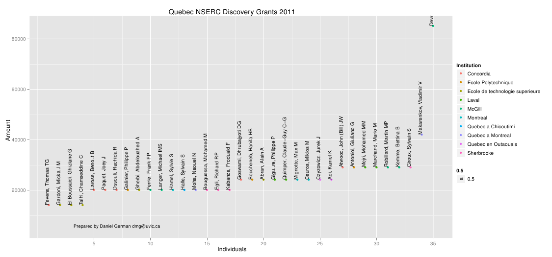
A simple way to visualize this data is tot plot individuals to amounts. Colours reflect the province (click to enlarge):
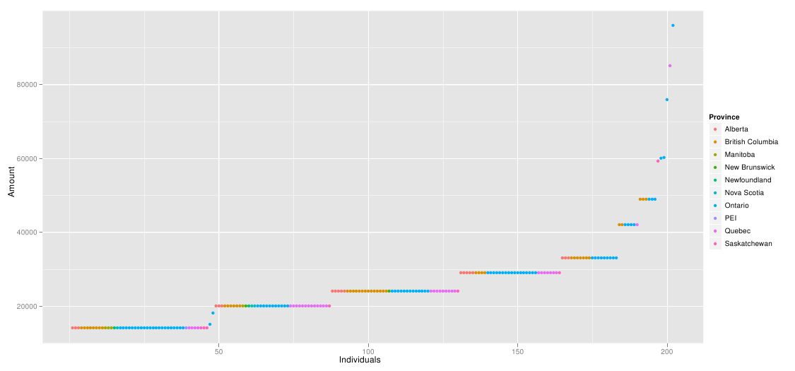
As it can be seen, there is a fairly uniform distribution across the lowest amounts, with few outliers to the right. Not surprisingly Ontario is the most frequent. Ontario and BC represent most of the points at the right side. It is surprising to see the absence of Alberta there (its highest is 33k).
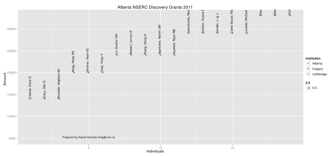
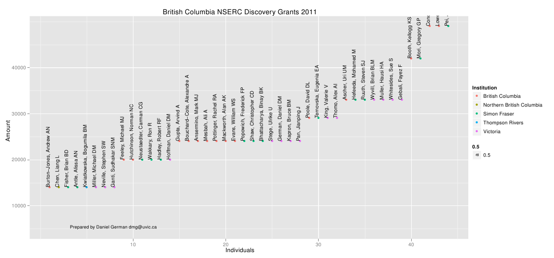
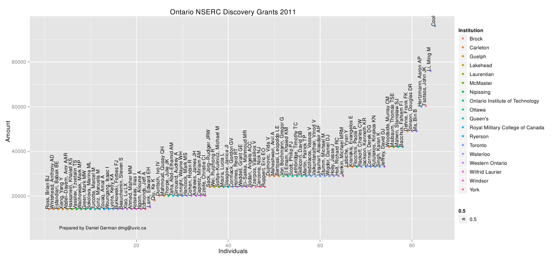
Here is a breakdown of the 4 big ones:
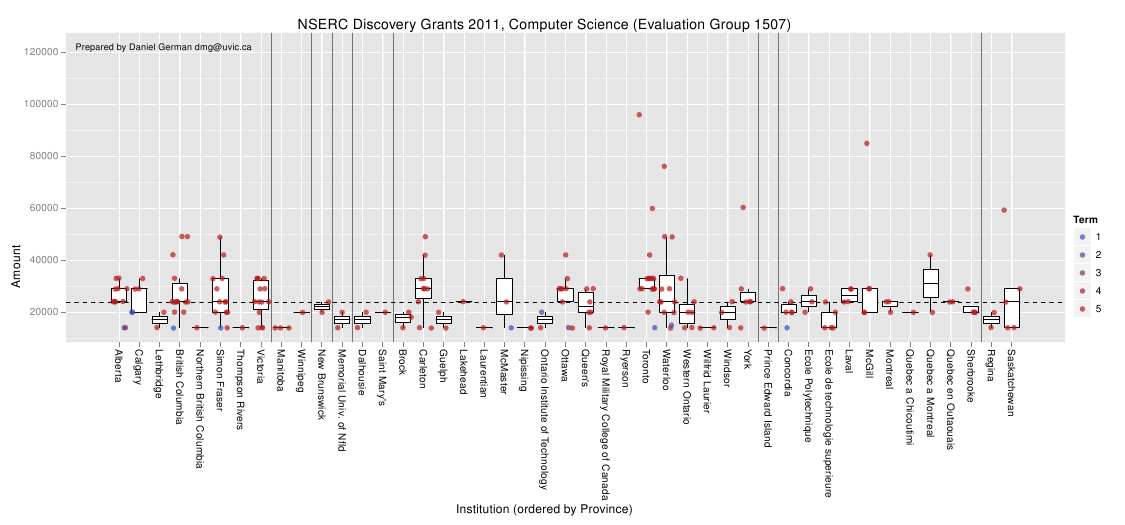
How do institutions compare?
I present the results arranged by University. Each vertical column is a university; they have been sorted by province. Each point in the plot is a recipient. The colour of the point represents the type of grant (1 to 5 years). Most are 5 years, with few being 1 year (what I call probation grant: they either have faith you can do significantly better next year, or they are giving you a warning signal).
The median across the country was $24k per year (in the spirit of disclosure mine was $24k).
The boxplots are a simpler way to compare universities and are overlayed on the data. I have removed outliers from them to avoid confusion with the data points. Of course, if you have paid attention to your stats courses you will know that boxplots are good when the data is normally distributed (which I don’t assume it is). Hence their use in this data is flawed, but they are still useful.
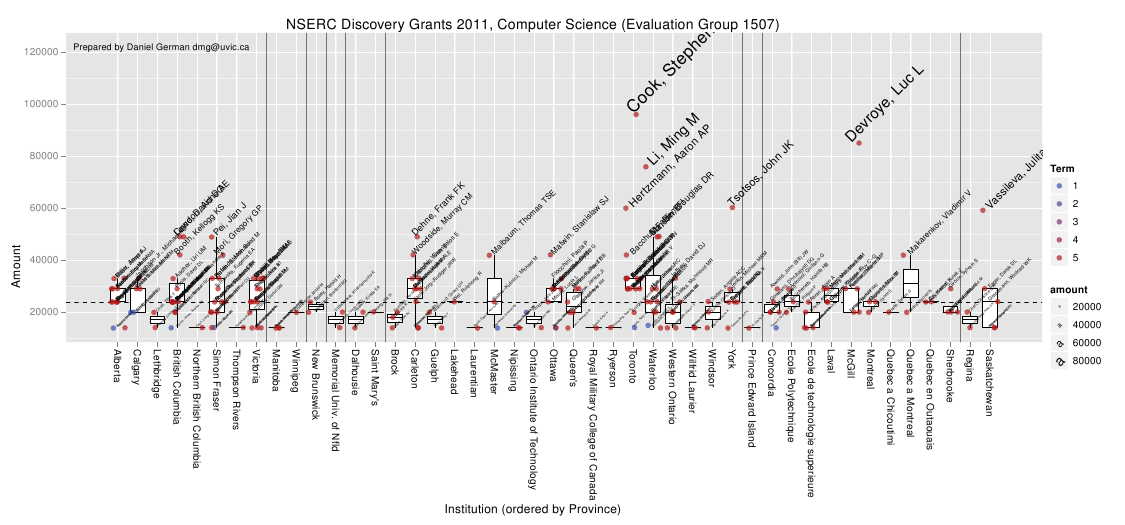
I also got curious who the high fliers were. And below the points are labelled.
–dmg